Lori Whitlock has a few release today with some absolutely gorgeous flourishes that are just perfect for layering. and I've layered three over each other for this design starting with a dark pink, then light pink and then the strong black to balance the heavy dark glass look frame.
Today I wanted to show you how to take a basic element and give it a glass look.
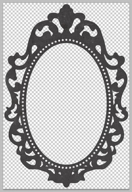
I started with Lori's frame element.
LW-Fresh-Air-Element-28 Frame
before
Take the file and apply the style.
You can install .asl files like you install fonts, brushes or actions. There are many free sources available
here is one I've used http://www.gfxtra.com/photoshop/11270-photoshop-glass-styles-asl-with-psd-file.html
Some are easlier to use than others but it's worth investing some time and exploring.
Thanks for visiting.
Lisa


THat frame is FABULOUS! and love the flourishes! so pretty and girlie :)
ReplyDelete